Welcome back! Now that we have a floor plan in place, I feel like I can start inserting color and fabric at The Shack. It’s time to start picking paint colors and buying furniture, etc. All this, while getting some work done. Since this house is for our own enjoyment, we plan on doing a lot of the work ourselves…my husband and I enjoy DIY projects, I like to think we’re good at it, and it’s very fulfilling to know that you’ve transformed something for the better, with your own two hands! So it’s time to roll up our sleeves and get busy.
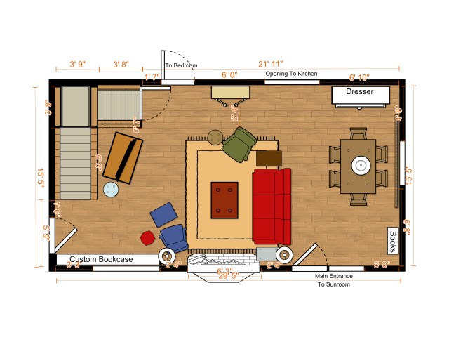
Before: Here’s the floor plan I ended up with, grouping the seating area around the fireplace. I definitely want the fire to be a major focal point in this little Mountain house. It’s such a bonus feature, and I can just picture us cuddled up beside the hearth on a snowy evening!

I mentioned that I have a sofa-sleeper upholstered in red fabric, which I plan to re-purpose in this space. So I knew I needed to incorporate some of those warm colors into the open floor plan. Amazingly, when I was out shopping for clients one day, I came across a wool Karastan rug in just the right colors, and it was on clearance! I failed to take a ‘before’ picture of the rug, but it is very similar to the one shown here, by Traditional Weavers.
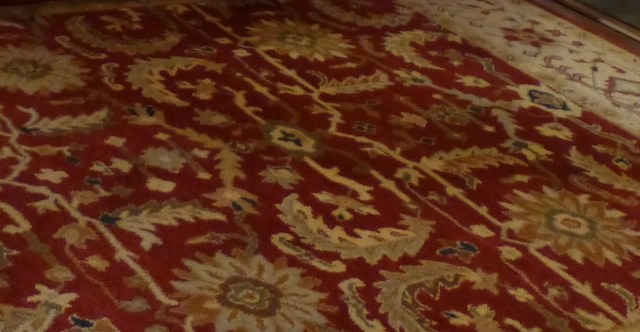
Here’s a blurry little segment of the actual wool Karastan rug I purchased on clearance for The Shack. I was so excited to get a fantastic deal on this rug!! In this image, you can see the rich rusty red color, with pale golds and creams. There’s even some teal blue and olive greens thrown in there. I love that the rug is warm tones, and that it has lots of color options which I can bring out in my furniture and accessories. It is approximately 8′ x 10′, so will be just the right size for my furniture grouping.
Often, when I’m picking paint colors for a client’s home, I start with a textile. Sometimes it’s a drapery or upholstery fabric, other times it’s an area rug, like this one. A patterned textile gives you many color options and becomes the glue that ties all the elements in the room together. So it’s only after I found this rug (even though I already had a red sofa) that I could begin thinking about paint colors.
You may recall that the interior of the space was already what I describe as, “the inside of a toilet bowl, pre-flush.” Sorry, I know that’s a bit crass, but the entire space was hideously sponge painted in pale yellow and mustard gold. It was a super dated 1980’s style.
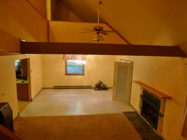
Before: The main living area of The Shack, as seen here with it’s original sponge painted yellow walls, multiple unattractive flooring materials and various other dated elements. There are many changes planned for the future!
So I knew I definitely did NOT want to draw out the warmer yellow and gold shades from the rug, and put it up on the walls. I wanted a change…for the better. Of course, I’m sure you’re well aware that grey and greige are all the rage right now. These tones, plus crisp white, make even the smallest home feel lighter and brighter. So I’m definitely leaning towards selecting wall colors in that range, while still inserting some warm color on the furniture, pillows, and other items in the room.
Here’s what I selected for the walls and ceiling.

A bright fresh flat ceiling paint will be used on all the ceilings and the outside stair wall.

This is Sherwin Williams 7029 Agreeable Gray. I’m planning to paint it on the dining room and kitchen/bedroom wall, just to give a little contrast.

This is Sherwin Williams 7021 Simple White. It’s a very pale, warm stoney grey–not really white as the name implies. All the rest of the main living area walls will be painted this color.
With these wall colors, I also plan to paint all the brand new trim a super chalky white. The product I’m going to use is Miss Mustard Seed’s Milk Paint in the color, Stoneware.

Milk paint comes in powdered form. You just add water and mix it up, then paint it on with a regular old paint brush. You can play around with consistency, but in general, milk paint is much thinner than regular paint. Usually I mix it in equal parts: 1 part powder to 1 part water. I find that it almost always takes two coats, and once they are applied, the finish is super chalky. On unfinished wood, the water in the paint will bring up the grain and give a rustic feel when the first coat soaks into the wood. This is a look I’m hoping to achieve with all the wood trim in The Shack. I think the matte finish and rustic texture will be really great for a mountain house! Plus I love the idea of a historic finish–milk paint is something that has been used for centuries and it’s non-toxic too!
Well, that about does it for paint colors in the main living area. Although I DO have something special planned for the fireplace mantel…I’ll have to share about that in a future post. I really love these warm soft greys and super bright whites together. They will create the perfect light and airy backdrop for the pops of bright warm colors and rustic antiques I want to use in The Shack. Next time, we’ll talk more about the painting process and maybe even discuss that ugly ceiling in the dining area!
Until next time, make sure to like Robinson Interiors on Facebook, Instagram, Pinterest, and Twitter, and DO stay tuned for future updates on The Shack!
Click on this image to be taken directly to my website for more information on Robinson Interiors.

