A while back, we discussed the eclectic feel I’m hoping to create by using vintage and antiques in my Bucks County Designer House Sunroom project.
You can read about that here: http://wp.me/pEVbo-7l
Today, I want to focus on my Color Scheme for the designer house room. Let’s review what we already have:
the Duchesse Brisee has that wonderful soft fleshy-pink color on the upholstery,
the chairs have a golden rattan finish and plush creamy upholstery fabric,
the area rug is brown/gold/gray cow-hide strips,
the existing woodwork is stained gray, and
the floors are gold, rust, pink terra-cotta tile.

The terra-cotta floor tiles are lovely and feature rose and gold tones, which I’m hoping to incorporate into the room’s design.

My duchesse brisee which is one of the inspiration pieces for my designer house sunroom project.
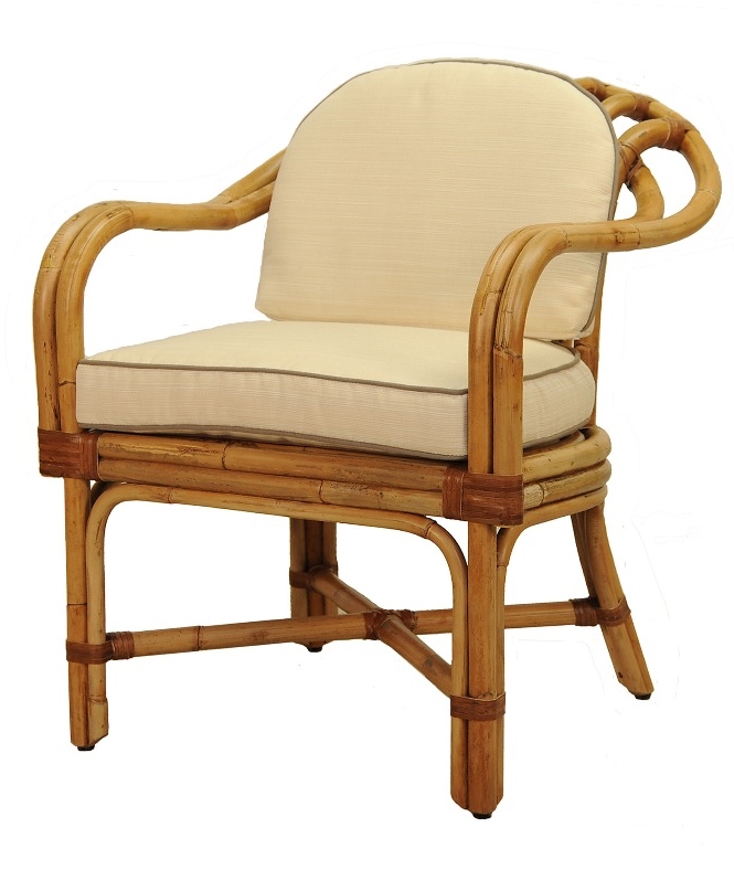
An image of a Vintage Rattan Chair. I have a similar pair I’d like to use in my Sunroom.

A super soft, ribbed-chenille fabric that I’m using to reupholster the rattan chairs.
Don’t forget the sunroom also has a pretty gray stain on all the woodwork surrounding the windows, around the doors, and on the entire ceiling. It also shows up in the grout on the tile and the stone work ledge that runs around the perimeter at the bottom of the room.
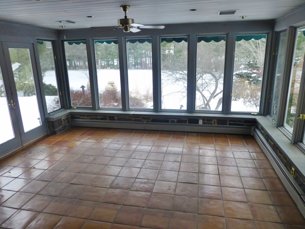
Visitors to the designer house will enter my space from this direction after leaving the kitchen.
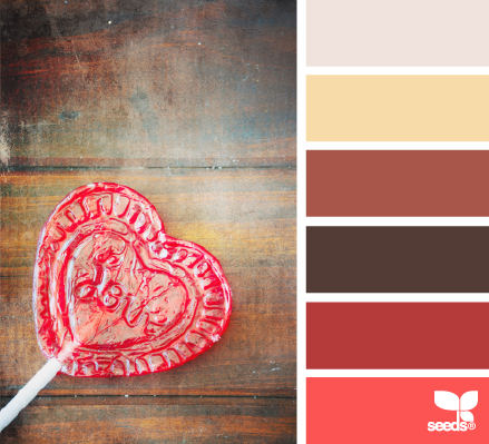
That brings me back to my color scheme. I now have: Gray, Gold, Orange, Peach, Salmon, and Pink. A really beautiful sunset-glow, color scheme. Check out these images from ‘Design Seeds’, which give you a sense of how the color scheme will look.

A color inspiration photo from Design Seeds. Don’t you love the fresh happy feel of this palette? It’s like a beautiful summer sunset!
Here’s another palette similar to the color scheme I’m using in the Sunroom.
Finally, I picked up these terrific Ikat pillows that will tie everything together beautifully, don’t you think? Ikats are so popular right now, and they seem to add an air of well-travelled sophistication. The pillows will add to the eclectic mix of items in my space. I think I’ll place them in the rattan chairs. I feel it’s so important to have a fabric, or piece of artwork…something that combines many of the color elements and links them all together in one tidy package. It helps the individual colors make sense as a team. These pillows are that link for my space.

This pair of vibrant Ikat pillows will pull everything together nicely in my Sunroom designer house project.
We’ll talk more about the Designer House in upcoming posts. I can’t wait to show you the other items I’m planning to use in my space! Until then, feel free to visit the BCDH website here: http://www.buckscountydesignerhouse.org/
Make sure you take the time to post a comment and let me know what you think about my plans for this room. I LOVE to hear from you!
And please, tell everyone about Kristine Robinson’s blog. I need all the friends I can get!


Those are sure some happy colors! Good for you 🙂
Yes, Donna. Although the ‘envelope’ of the room is gray and pretty neutral….the strong pops of colors throughout will make things very cheerful! Thanks for commenting. 🙂
Ooooh! loving that ikat cushion! xxx
It is truly a nice and helpful piece of info. I am happy that you shared this helpful info with us. Please stay us informed like this. Thanks for sharing.
HEIDI http://www.net-ict.be/
Fun stuff Kristine! So glad I clicked to see you did post an update with your color palette and fabric choices – GREAT choices. I really love your choice of seating and your color palette reminds me of the sunrise – perfect for your sunroom. And can’t leave out those fabulous ikat pillows – love those and perfect for the room. Doesn’t it just make you giddy when things start coming together. Great work and looking forward to seeing it.
Thank you so much, Holly! You are so kind. I’m loving the sunset colors–bold, yet nature-inspired for the sunroom. I’ll be sharing more, as things progress! Thanks again for commenting.